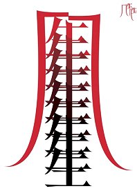
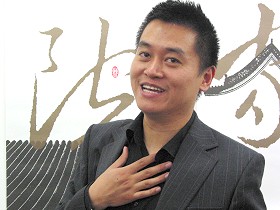
He Jianping
China, 2005
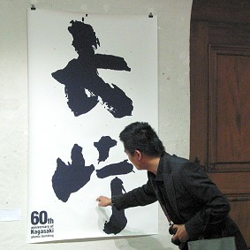
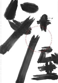
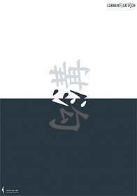
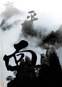
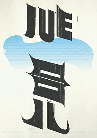
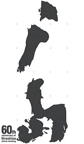
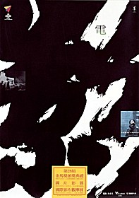
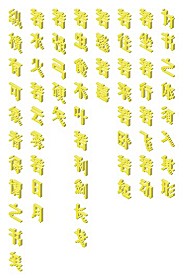
In this poster by Wang Xu in memory of the atomic bombing of Nagasaki, some of the strokes of the name of the city are missing to evoke the ruins. Jianping He points to the respective part of the chinese character.
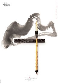
The following figure captions and pictures were kindly provided by Jianping He, who also designed the exhibition poster. Please see the News item for an introduction in english, german and chinese.
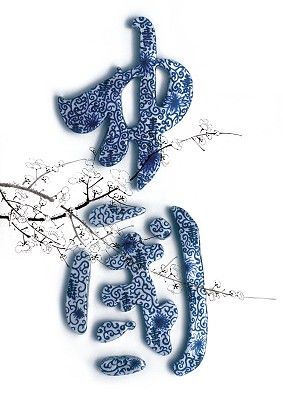
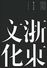
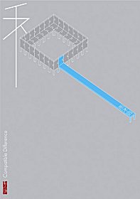
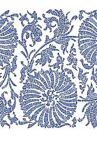
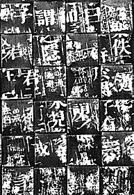
The poster at left, also made by Jianping He, for a taiwanese poster exhibition with the theme "Chinese Character", is my all time favorite. The meaning of the two characters is "China", they were formed in ceramics by the sculptor Sonny Kim He, and painted in the traditional decorative pattern found on porcelain tea cups which are also called "china" in the western world. The peach blossom branch is a symbol of Taiwan, which unexpectedly, for me, transformed this esthetic master piece into possibly the most beautiful political poster ever made.
I can not read chinese, nor would I know the background, if Jianping He had not told me. He had many more stories about the posters as he was guiding the swiss students through his exhibition, a real eye opener, which brings up the point whether you can enjoy a poster, or an other work of art, or another culture, without "understanding" it? The answer of one of the locals attending the opening was a resolute "No!", if he could not read what was on it how could he know if he liked it or not. My personal answer on that question is that I know so little about so many things that I would derprive myself of a lot of beauty if I insisted on understanding all. Also much fun would be spoiled. And eating from the tree of reason got Adam and Eve thrown out of Paradise, and that's the last thing I need.
Which then brings up the related point how these posters would fare in international poster competitions? A very prominent non-chinese designer and frequent jury member told me that if he did not understand the language, he would always ask for a translation, as otherwise he would be unable to decide if form and content of the poster were in harmony, an important quality criterion for him. Well, the translation of the poster at left is "China", as mentioned before. Does this make the poster any better or worse or clearer? There is a lot of cultural context that simply escapes these "200 posters in two days" type of judgements.
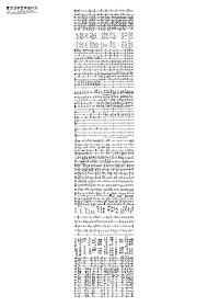
A typography poster exhibition in non-latin alphabets, be it iranian, chinese or even cyrillic, always excites my curiosity if there are any common typopgraphic rules or theories that apply to all of them? If not, what is alphabet specific, and why? The answers I heard from typography experts were always quite vague, mostly retreating to the position that if you do not understand the content you can not say anything about the form. If you disagree with this, I would love to hear from you.
Jianping He has done a great job of introducing poster designers from the western world to his chinese colleagues and students, through his numerous book publications. I feel very privileged that he now also presents his chinese friends to a western audience, like in his first exhibition in Berlin in 2001. We still have a lot to learn about China to be able to fully appreciate these works, and the chinese designers are ahead of us in the business of knowing the other side. But from what I have seen in Lucerne, it will be an exciting trip.
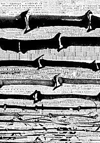
 Jianping He in front of a poster by Zhao Feng, "Impressions of Shanxi", 2004