|
I don't understand or like these posters, neither on an emotional or intellectual level, and they leave me cold. I am frustrated that the only message that gets through is "It's your own fault if you don't understand them". Also, I don't understand what is so good about these posters and why they made it to the top of the heap.
The following comments are not a value judgement but are intended as a feedback from an outsider, to the designers, to the jury and to the organizer of the competition. They do not apply to all 100 posters of the competition, but the fact that these 12 are among them worries me enough to dig a little deeper:
What could be the reason for my failure to understand the posters above?
- A sign of the times
The leading polish art historian and former head of the Warsaw Poster Biennial, Dorota Folga-Januszewska, published a text in 2002 about the lost meaning in contemporary posters under the title Cool about suicide, hinting by her choice of words where the endpoint of this development is. Her message, in a nutshell: Live with it!
A more recent version of this thesis is the current proclamation "Poster designers are meant be loved, not understood!".
- Not enough good posters submitted
I estimate the number of different posters in the three countries to be of the order of 10'000 per year, and maybe an equal amount of wild posters. In Berlin alone I find about 500 different posters on any given day. The competition received about 1700 jpgs, they were pre-selected online by the jury down to 533 which were then submitted on paper, of which the jury picked the 100 best in a meeting in Berlin. Maybe there were just not enough good posters among these and some weaker posters just had to be included to get the 100 required for the exhibition. I do not know the reason for the tiny participation, nor what kind of self selection takes place even before submission, it could well be that the really good posters never make it to the jury. I am always fascinated by the rich wild poster scene in Berlin, mostly for politics or music, but have never seen any of them in the exhibition. I know that some designers object to the high participation fees. In any case, the title "100 best posters of Germany, Austria and Switzerland" is exaggerated and misleading.
- Target group
Maybe the posters were not designed for the general public, but for small target groups to which the jury members also belong, but I do not. They could be colleagues of the designers, students, professors, friends, other poster designers, climate changers, Star War fans, AGI members, jury members ... . The target groups have common values, standards, beliefs, also preconceptions, which can be quite different from those of other groups or the general public. Get lost if you don't belong! Also called inbreeding.
- Sociology and psychology of the jury
Maybe the jury (I personally know most of this year's members (Verena Panholzer (AT, jury president), Reza Abedini (IR/NL), Christophe Gaudard
(FR), Holger Matthies (DE) und Felix Pfaeffli (CH)) and respect and admire their work) had strongly divergent opinions and finally agreed on the least common denominator, the ones nobody really disliked strongly. In this case the jury president would have to be blamed for not recognizing and correcting the problem
- What is a poster ?
Maybe my idea of a poster differs from that of the jury? For me, a poster is a piece of paper designed to transport a meaning, to sell a product or idea, to provoke an action. A poster that I do not understand or like is almost a contradiction in itself. Yet why are so entirely different objects as a jpg on Facebook, an entry in this competition, a commercial billboard, a movie or football star poster all called "Poster" ? Why is there practically no overlap between the posters of the Gewista Plakat Party in Vienna, the
Swiss Poster Award and this competition when all three claim to know what the "best" poster of 2013 was? Is the selection a random lottery?
- I am the only one who does not like them
I am an idiot with neither taste, education nor experience and don't have a clue what this is all about, and nobody wants to hear my views anyway. This is the most common explanation that I hear when I dare to disagree with generally accepted opinions. Personally I do not favor this theory, but it is easy to understand and may explain it all, who knows .. 😉
Some more considerations:
- Style
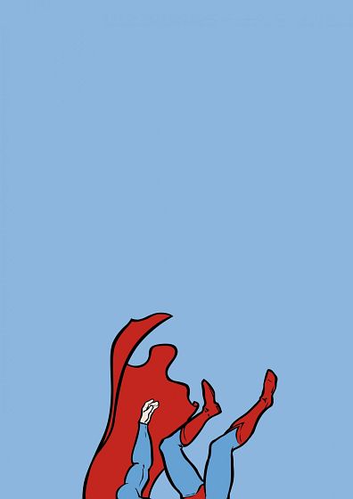
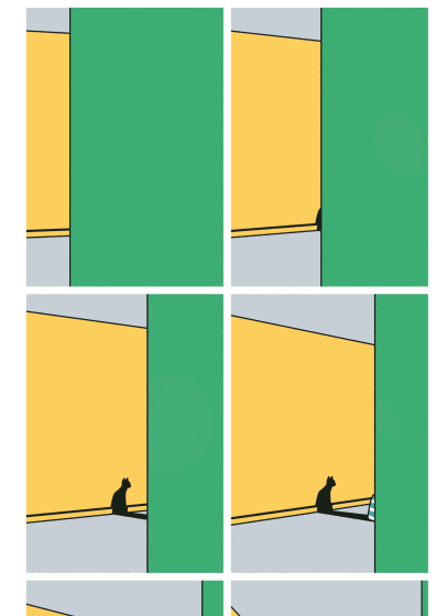
Most of the posters above use very few colors, and all have uniform backgrounds. It has always surprised me why the rich and powerful tools of photoshop and digital photography are so universally rejected by the graphic design schools, instead pushing finger paint, paper and scissors and crayons, and minimalism in color, form and idea. As if texture and detail would not exists and the psychedelic revolution had never happened, aiming instead for a visual style common before the invention of color lithography. It is not surprising that with these restrictions on style there is a deja vu effect even among the winning entries of the same competition (posters 01, 02, 03).
- Visual communication
I have a very high opinion of the power of visual communication. This is a fantastic tool, in many situation far superior to textual or verbal communication, or body language. Just imagine to be in a foreign city with nothing but a list of street names, no city map, and trying to find a hospital. Or finding the men's room in Kasachstan without some visual communication on the door.
But what do we have here? A visual communication so murky that it is unable to get its message across by itself. I'm sure if I spend an hour with each designer and he would be trying to explain with words what he wanted to say with his poster, I would understand it better, aha, maybe I would even enjoy it. The figure caption in a museum or in a catalogue sometimes helps, but in the streets a poster has to stand on its own. "A good poster explains itself" was not invented by Shigeo Fukuda, but practiced by him.
- Cultural background
I would hesitate to judge a contemporary chinese or japanese poster if it fails to communicate with me, simply because I do not have the necessary cultural background. While I do not understand the text of iranian or japanese or indian posters, many of them communicate something, maybe their elegance in composition or color or typography. On the other side if I don't understand a german or swiss poster, I can not blame my cultural background, as I have lived here, and observed the language of posters, for most of my life.
- Clichés
"A cliché is an idea or phrase which has been used so much that it is no longer interesting or effective or no longer has much meaning."
Examples:
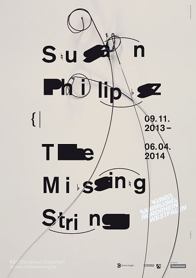
- Making text difficult to read, so you have to come real close, tilt your head, look twice etc. before you understand it (posters 02, 03, 07, 08, 09, 11). The theory behind this technique is "If you spend so much time with the poster you will never forget it"
- Drawing a frame, then have the picture leap outside of the frame, to evoke depth (poster 12). The technique was used as early as 1000 A.D. in the illuminated manuscripts of the Beatus Apocalypse, or later in 1280 A.D. in a fresco by the italian painter Cimabue and many times since. A more recent example is Milton Glaser's Big nudes from 1967.
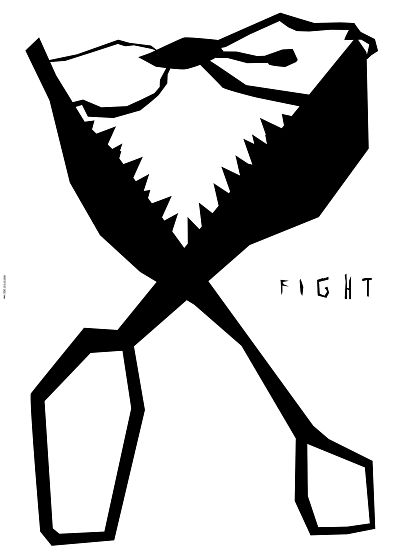
- Posters in the form of comic strips (poster 04) were used by Maiakovskii and others in their ROSTA windows in the 1920s and 1930s; a more recent example is Milton Glaser's Mozart sneezes from 1983. Remember Mickey Mouse?
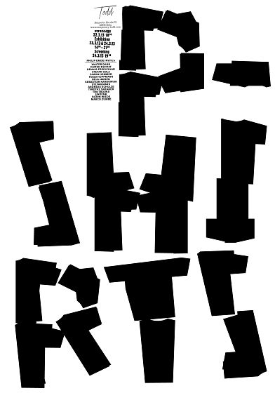
- Minimalism (poster 01, 02, 03, 08, 12) has appeared in some swiss posters in the 1960s, but has recently reached viral proportions. A god example are posters from the austrian designer Albert Exergian.
- Filling in the white spaces in the letter B was a gag used the first time (to my knowledge) in 1950 by Armin Hofmann. A poster selected in this competition (not shown here) is variation number 22 of his idea.
- A poster that looks like a printed page from a book or dictionary, with handwritten amendments (poster 05). Jochen Fiedler's 1975 poster of Friedrich Engels, where "short-sighted" is changed to "far-sighted" comes to my mind, or all the election posters that show you how to fill out the ballot.
I have no objections if somebody occasionally uses a time proven visual vocabulary invented by somebody else, and realize that life is often hard, and memory short, but I think a competition that values creativity and originality should not reward clichés.
|