


|
|
|
|
|
|
|
|
|
|
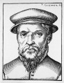
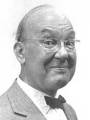
If you think a great typographer has to look like one of the tough guys above, it's time to get to know the one below:
|
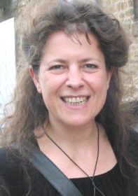
Catherine Zask in Chaumont, 2003 |
You find more information on Catherine Zask in the excellent web exhibition from Pixelcreation. All posters below are silk screen prints in 2 or 3 colors, 120 x 175 cm. |
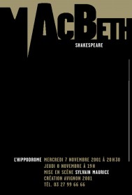 Macbeth
2001 © Catherine Zask "Macbeth summed up in one line would be: 'the madness of power hunger'. This is what I've tried to display: domination, force, foulness, stabbing." |
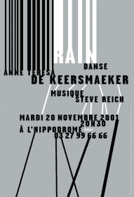 Rain
Rain
2001 © Catherine Zask "In 'Rain', the lines change direction when they go through the filter of words. It's also what I like in life: that it's made up of crossings, experiences that transform us. I wanted to set up an ensemble that would interconnect all the elements, where rhythm, motion and coherence were materialized. The key theatrical elements are present: on stage, rain was represented by a curtain of metal ropes, lines crisscrossed on the floor, and there was repetitive music composed by Steve Reich. " The poster 'Rain' was awarded the Grand Prix at the 20th biennial of graphic design, Brno (June 2002). |
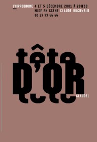 Tete d'or
2001 © Catherine Zask "A symbolic representation of typography used in a radical fashion. The violence of the text is echoed by the word 'tete' (head) cut in half." |
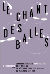 Le Chant des balles
2001 © Catherine Zask |
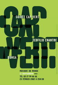 Cap-Vert
2002 © Catherine Zask "This poster grew out of the idea that when you dance to Cap Verde music, you sway: that's why the letters are disjointed: they're swaying. François had some input on the thickness of the letters and added the transparent effect. I think this enriches the idea. Together, we finalized the composition and the colors." (François Malbezin was Catherine Zask's assistant at the time) |
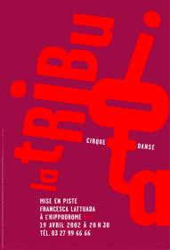 La Tribu Iota
2002 © Catherine Zask "The two points echo each other. The composition is based on non parallel slants from which lines branch out, generating an explosion in the poster." |
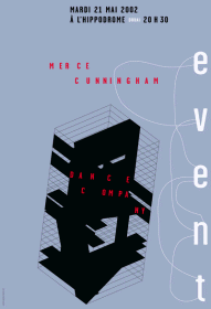 Merce Cunningham
2002 © Catherine Zask "For this poster, I used Alfabetempo seven years after its creation. It is obvious that what's written here is "Merce Cunningham". There is a great deal of black, it 'grabs' your attention and remains enigmatic. People often think they see an architectural reference; those familiar with the choreographer's work see traces of the floor projections he uses onstage I simply wanted to do something in the vein of John Cage's philosophy, where "the idea of collaboration had to respect a principle of total independence from the various media, and not the integration of one by the other" (Julie Laty) by spotlighting a very personal aspect of my work: Alfabetempo." |
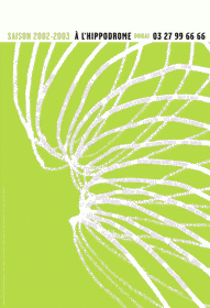 The 2002-2003 season - L'Hippodrome
2002 © Catherine Zask "The season's program whirling in spirals." |
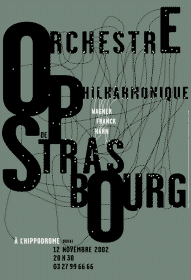 Orchestre philharmonique de Strasbourg
2002 © Catherine Zask "Looking at a photo of the orchestra, I was amazed by the number of people on stage. 150 musicians! I wanted to represent swarms of people by these 150 shining dots. All the dots are interconnected, creating pathways and interactions." |
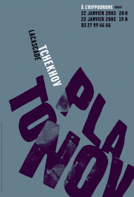 Platonov
2002 © Catherine Zask "I wanted to simultaneously evoke power and ruin. I printed 'Platonov' in bold type, I cut out and crumpled the paper, and then took a picture of it. A plastered wreck, Platonov goes to pieces and crashes at the bottom of the poster. An anti-Macbeth." |
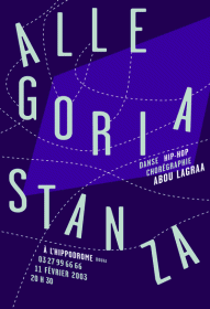 Allegoria Stanza
2003 © Catherine Zask "Dotted lines like footprints, eleven paths for eleven dancers. On another plane, a blue screen evoking video décor." |
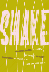 Shake
Shake
2003 © Catherine Zask "A music-hall show made out of scraps, with garish costumes; flashy, hilarious, extravagant, marked by British wit. I couldn't resist shaking up the letters." |
See more posters of Catherine Zask at her web site www.catherinezask.com
| The famous typographers at the top of this page are, from left to right, Garamond, El Lisitskii, Jan Tschichold, Wolfgang Weingart, Bruno Monguzzi, Morteza Momayez, Wladyslaw Pluta and Philippe Apeloig. |