Jianping HE was born in 1973 in a tiny farming village half a day's train ride southwest from Shanghai.
It was at the peak of the so-called "Cultural Revolution" in China,
a mass campaign of enormous dimensions, during
which many hundreds of millions of posters were printed and distributed.
It was also a time of great suffering; his parents were sent 200 km in opposite directions to work in the fields,
and little Jianping was brought up by his grandmother until the nightmare was over.
Today, he finds himself working in Berlin, one of the centers of graphic design of the western world , and has reaped attention,
awards and prizes from countries like Poland, Finland, the United States, France, Mexico and, fortunately
also from China, his motherland with which he maintains close contact.
What kind of posters would a graphic designer with such an extraordinary background make? German posters in the style of
Heinz Juergen Kristahn, his professor and former mentor at the University of Arts in Berlin? Posters in the style of the
chinese avantgarde that are currently so popular with all the international juries? Computer dominated global
high tech style with ten transparent layers, 64 million colors and twenty fonts, all of them out of focus, upside down and
unreadable? Would childhood memories of social realism posters, or chinese peasant paintings show through?
Can a chinese graphic designer find peace in latin typography, or even have an advantage over the typographic
monolinguals? The answer is yes and no to all these questions; as usual, I leave it to the reader to decide.
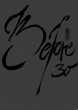
The posters below are taken from the book, relatively unknown in the top row, and famous (and discussed in detail in the text)
in the second row:
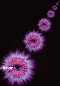 2001, Poster for the Fubac Digital Print company, that made the giant versions of some
chinese posters shown in the
2001, Poster for the Fubac Digital Print company, that made the giant versions of some
chinese posters shown in the 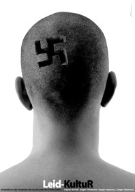 2000, Anti-nazi poster in response to a german politician who coined the
ill-conceived term "Leit-Kultur" (leading culture) to imply superiority of german culture.
By changing only one character in this expression, the quick-witted Berliners made it
into "Leid-Kultur" (culture is suffering)
2000, Anti-nazi poster in response to a german politician who coined the
ill-conceived term "Leit-Kultur" (leading culture) to imply superiority of german culture.
By changing only one character in this expression, the quick-witted Berliners made it
into "Leid-Kultur" (culture is suffering)
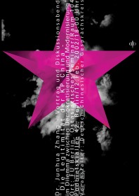 2001, Poster for a talk on the Chinese Communist Party, at the Free University Berlin
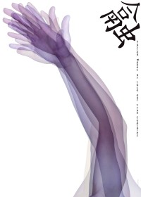 2001, Poster for the 2. International Poster Exhibition in Ningbo, China with the theme "Fusion".
The text reads "Fusion makes us loose our true features"
2001, Poster for the 2. International Poster Exhibition in Ningbo, China with the theme "Fusion".
The text reads "Fusion makes us loose our true features"
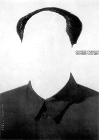 1999, Poster for the 1. International Poster Exhibition in Ningbo, China, with the
theme "Fashion and Culture". (Honorable Mention 13th Lahti Poster Biennal 2001)
1999, Poster for the 1. International Poster Exhibition in Ningbo, China, with the
theme "Fashion and Culture". (Honorable Mention 13th Lahti Poster Biennal 2001)
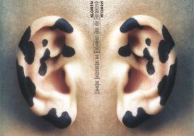 2001, Cloning, visual commentary on the discussion about genetic engineering
