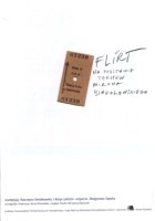
1) Anna Klonowska, Flirt 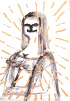
2) Masaaki Izumiya, The Choice '01 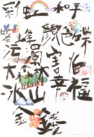
3) Kan Tai-keung, Cities Discoveries |
Changes have come. We have entered an era of applied disorientation,
picturesque, even lyrical, poetry of free associations. Before us a review of new
poster resistance. It might be tempting to say "anti-poster"
but it would be untrue, as we have in front of us works most
honest in their artistic aspect, whose authors had discovered
the pleasure of playing ambiguity game with the spectator.
The poster was born from double-sided play of associating vision
with text. It has used the power of symbols, literature-
based ambiguities, capacity of play on words. Its inherent
characteristic was comprehensibility, although not always,
and not for everybody. Roots of the poster grew from occasional
graphics of the 17th century. The National Museum in
Warsaw holds in its collection a 17th-century "character" -
a woodcarving used as charms against plague and other
diseases (MNW, 29414). This smallish graphic work was
used as a kind of a pre-bill. Stuck in the times of plague on
doors of houses, churches and on execution posts in market
squares, it provided information and warning. At the turn
of the 17th and 18th century European art bore many other
graphic forms predicting the "art of the street", Allegorical and
epitaphic compositions or court announcements introduced
people slowly to the world of "inscribed picture". 19th
century discovery of lithography supported the tradition, and then
came a sudden burst of Alfons Mucha's colorful Art
Nouveau posters. Our eyes hold this vision even till today.
Art deco lines, decorative and sophisticated drawings, well
visible inscriptions, full of typographical fantasy. What could
not be seen, could be read. This poster was not yet a bullet
shot right into a passer-by, but its provocative force was great,
and expansion of this graphic form made it into the most
important weapon of advertising.
Throughout the 20th century formal changes came quickly one after another and poster constituted itself as a field of graphic art, with its carefully observed rules of associating a visual with an event. Artists of different cultures opened reservoirs of symbols and it was on posters that globalisation of signs happened in the fastest way. You could even see canonical spheres of poster, such as e.g. transformation of head (eyes, lips, ears as separate motifs), hands, feet, cross, which even in the furthest corners of the word would be comprehensible. Another strong trend to appear was poster "without subject", using abstract forms (e.g. geometrical figures) and color splashes to give shape to tension contained in the text. Educational system aiming at teaching rules for creating "challenging compositions" has been formed. In spite of deep transformations in fine arts, during this whole past era, "poster game rules" were observed. However, they started to gradual y loose their force and in the last years several voices have heralded the "anarchisation" of poster - its rich ambiguity. This anarchisation was accompanied by progressive devaluation of symbols present in the whole contemporary iconosphere. Shortly, the poster was becoming incomprehensible, or even worse - misinterpreted. If it was comprehensible at all, it was only to insiders. Antiglobalistic reaction produced regionalisation of code. Intellectual access to some works was purposefully narrowed to a chosen group of viewers and this phenomenon did not limit to European or American poster only, but also took over poster originated in the Far East. This year's Biennale allows us to see this new exclusivity of poster especially clear. Both Polish "Flirt" (1), as well as Japanese (2) and Chinese (3) story signalize the working of "separate worlds". Associations evoked by these posters can be various and touch a spectator not with a clear message but rather with curious ambiguity. Ambiguous advertising and contrary advertising - have become advertising of today. "It's just pants - plain, unfashionable pants" encourages an ad of a fashion house seen on Parisian streets in the year of 2002. Seeing a fish with the inscription www.endo.pl on a mega-poster at a highway, one of my French friends asked whether it advertised a company specializing in endoscopes and gastrology. His amazement was absolute when he heard that endo was a popular producer of children cloths and teddy bears. But what not so long ago constituted an opposite of "good" poster, becomes a more and more tasty piece of poster perversity. Years of comprehensible communication have rendered univocal messages unwanted. And "proper" form became improper.
|

4) Yang Liu, Today I'm going to the aquarium! 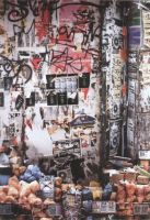
5) Fumio Kawamoto, The JAGDA Osaka poster exhibition 
6) Fumio Kawamoto, Deep Sea Water |
"Oh, oh, today I'm going to aquarium" (Oink, oink, heut geh ich ins Aquarium!) - says a pink pig, having attached a green crocodile tail and a green crocodile head (4). This is what new univeralism of contents looks like. Against a smooth black background of the poster shines a small, pink, curled tail, which has escaped over the crest of the attached tail. Political poster? Social? Ecological? Philosophical? I don't know! And that's what's most beautiful about it. Threads of misunderstanding more and more often replace metaphors and figures of speech, which used to create chains of associations evoked by a poster. Doubts and unclearness have become values searched for. Humor, sometimes cruel, sex without eroticism, unskilled-line drawings, blurred, unclear colors, sense without meaning - these are new heroes of active poster. The goblet of amazement has been filled by the fact that all these tricks of contemporary poster do not suffocate our liking for created visions. On the contrary, in the common reception there is clearly tangible acceptance for perverse, unruly and refractory attitude to norms and forms valid before. Such changes are accepted in a similar way as changes in clothing and objects of everyday use. Soul, and not functionality, is what counts most. An era of free associations, exclusive clubs, poster anti-Internet. A poster without any Internet address, or even a visible copy line (5), as well as a poster of thousands copy lines (6) form omni-communication, or association fields fully open to imaginativeness of a spectator. This is where the core of the change lies. Creator of contemporary poster gives his spectators a credit, trusts them to be intelligent and quick-witted, and they like playing with double meanings. Not wanting to simply attract or inform, contemporary poster more and more often proposes a game of several moves, extending its working time. Sometimes its creator assumes that the right association will dawn on a spectator only after a while. "What is it all about?" - it's about questions torturing far corners of associations. This psychological technique requires, however, many consciously used formal and technical gimmicks. In result, from the beginning of this century poster has taken inspiration from everything that had been tested in visual arts. It borrows from the aggressiveness of humorous press drawings, from the perfection of photography and digital editing, from the painting of gesture and Japanese calligraphy, from murals and graffiti, but does it with a different tone than even ten years ago. In the contemporary poster there is a recognizable charm of mad-suicide, who treats lightly his own annihilation. Designer's behavior seduces with the abstinence from correctness and foot-looseness of decadence, even more so, as it turns out that anti-rationalism can bring measurable profits. Similarly to fashion and industrial design each blemishing form becomes attractive, as banality of beauty and superstition of functionalism are too "straight in your face" to like them. And what matters, is the emotion - sometimes not fully recognizable, oscillating between love and repletion, passion or indifference, rather profit than loss, unpredictable as the poster of 2002. |
Dr. Dorota Folga-Januszewska is Deputy Director for Research at the National Museum in Warsaw, and Vice-chairman of the Program Council of the 18th International Poster Biennale
| Intro | Organizers | Jury | Winners | Posters & designers | Deja vu | Legends | Faldin | Wheelers & dealers | Brief encounters | Aartomaa & Loiri | Suicide ? | Street posters |
home previous exhibitions page last revised on July 27, 2002 / this section is part of Rene Wanner's Poster Page /